Is there a safe and easy way for youth to keep track of their period data?

PRODUCT DESIGN, END-TO-END, UI/UX, MOBILE APP
blueprint x the period purse

Menstruation Nation

A mobile app that enables menstruating youth to track their period cycles and encourage open conversations around menstruation.

Blueprint is a student organization that works with non-profits to provide software solutions. We worked with The Period Purse to help advance their goal of achieving menstrual equity through this project directed at youth. While many period trackers exist in the market, few are designed for youth and often collect and monetize user data. We hope this app can be a safe platform for youth to keep track of their period data.

Solution
A free period tracker designed for youth to learn more about their bodies by tracking their period cycle and symptoms, such as flow, mood, exercise, cramps, and sleep.
Problem
How can we help youth understand their period cycles better and empower them to learn more about their bodies?
Role
Lead product designer
Timeline
June 2021 – May 2022
Sectors
Health, non-profit
Team
2 project leads
6 developers
1 product designer (me)
key features

1. Log period and symptoms

Need
A simple way to record period dates, symptoms and be aware of general state of wellbeing.
Solution 1
Accordion system with dropdown options for each category, and engaging icons or emojis for each option.
Solution 2
Multiselect option for user to record period dates without logging symptoms.
User flows

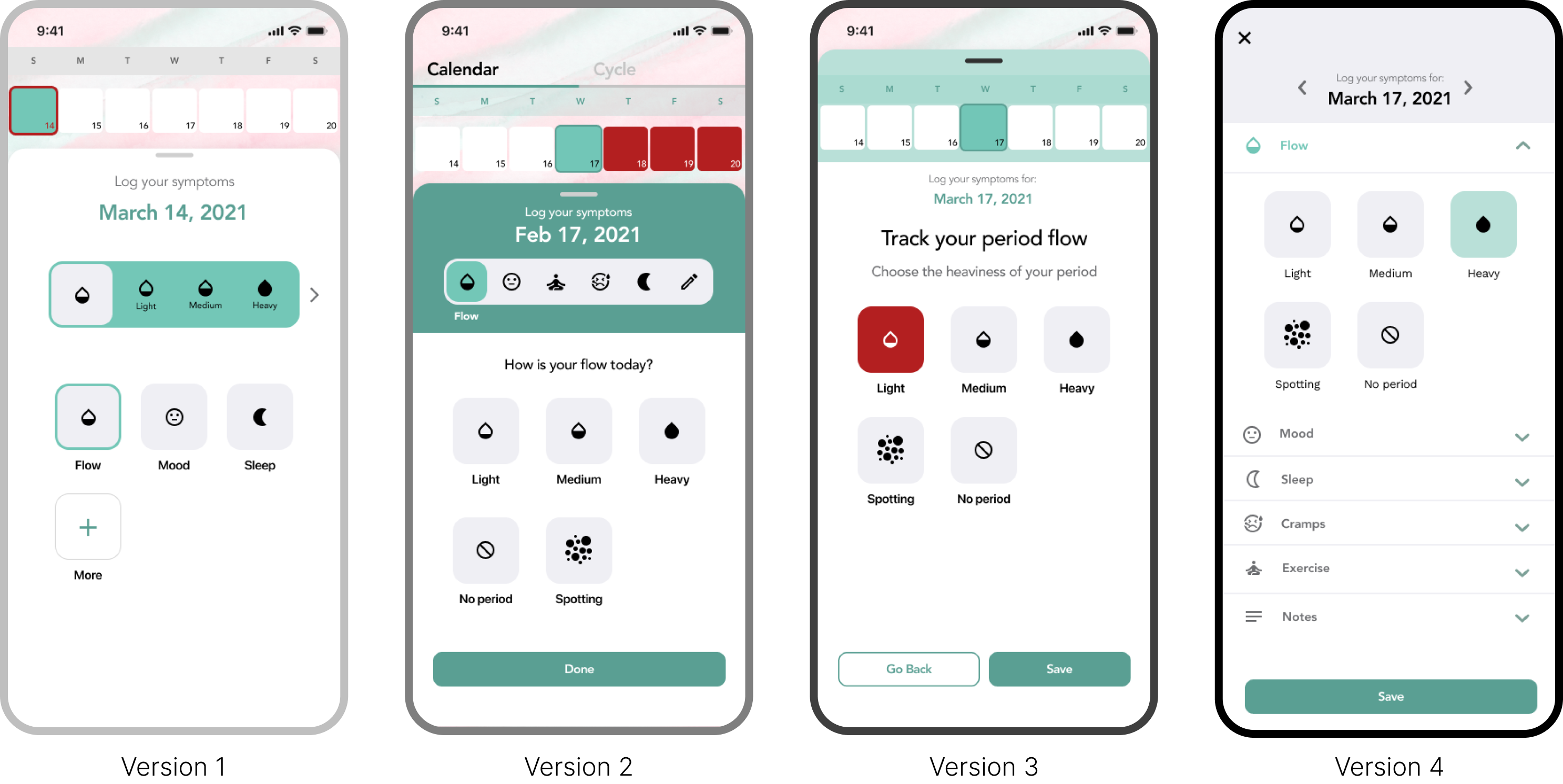
Being the core feature of the app, it is important for it to be easily accessible and discoverable. Hence, I designed a big red button placed in the center of the menu bar. Tapping the red button will open an overlay with two options as shown in the diagram below, affording users the choice to log symptoms for each day or to quickly select days without logging symptoms.

01
Log period and symptoms

The users need a simple way to record period dates, symptoms and keep track of their general state of wellbeing. This key feature is easily accessible from the menu bar. To cater for the needs of different users, we ask users if they want to record symptoms for each, or just select the dates to log their periods.

2. Calendar visualizations

3. Know your cycle

Solution
Need
Help users understand where they are in their cycles, know when to expect their periods, and know their period history.
  • Doughnut progress chart to visualize current cycle
  • Average period length
  • Average cycle length
  • Period history
User flow

From the homepage, users can quickly slide between the Calendar and Cycle pages by tapping on the tab menu on top, or swiping left or right anywhere on the screen.

testing & iterations

Usability testing 1

Goals
  • Bring in users to validate assumptions made during rapid prototyping.
  • Identify issues early and ensure our expectations align with users and clients.
Methods
  • 4 participants recruited with the help of The Period Purse.
  • Remote 30-minute sessions conducted via virtual Zoom calls.
  • Participants interact with the Figma prototype, share their screens and think aloud while doing given tasks.
  • Followed by a post-task interview.
Key insights
  • Horizontal scroll in symptom options is not discoverable.
  • Transition from onboarding to calendar was abrupt.
  • Provide more stats about periods.
  • Add option to enter without signing in.
  • Add option to add notes in symptom log.
  • Add option to log multiple days at once.

Usability testing 2

Goals
  • Identify any bugs before launch.
  • Identify any problems stopping users from completing tasks.
  • Find out how users would rate the overall experience using the app.
Methods
  • 4 participants recruited with the help of The Period Purse.
  • In-person 20-minute sessions.
  • Participants interact with the app installed on a physical mobile phone, with a researcher giving instructions and a note-taker.
  • Followed by a post-task anonymous survey (Google form).
Key insights
  • The calendar page was confusing, especially for first-time users.
  • The overall aesthetics was well-liked.
  • “Info” sounds unappealing and irrelevant.
  • The information section brings an educational element that distinguishes it from other apps.
  • The interface design was non-intimidating.
takeaways
1. Communicate with confidence
Having to repeatedly present my designs to project leads, engineers and clients during meetings, critiques and handoffs, I’ve learnt to be more confident and less anxious when talking about the designs. As the only designer on the team, I felt intimidated and worried about not being good enough. However, through this project I was able to have a lot of practice presenting, having discussions about design decisions, and navigating between different stakeholders and constraints. I also feel lucky to have worked with a very reliable team, who made me feel comfortable voicing problems when I encounter them, and helping me grow along the way.
2. Adapt, iterate, test
In the hand-off process to developers, we encountered many technical constraints that I haven’t considered when creating the designs. I learnt to re-evaluate and adapt quickly, and make decisions about whether it is worth the effort to pursue the original designs, or work around the constraints to create solutions that can achieve the same goals with less effort. Working in an agile environment, I had to make quick decisions and hand-off designs even if I’m not 100% sure about the designs. I’ve learnt to embrace imperfections, and believe that done is better than perfect, because having something developed means more testings can be done to evaluate and move things forward.
3. Document design decisions
Since the project was a year long, it was important to keep the design files organized and document changes made along the way. I also made sure to communicate clearly on where to find specific versions of the design, and created seperate pages for latest updates.